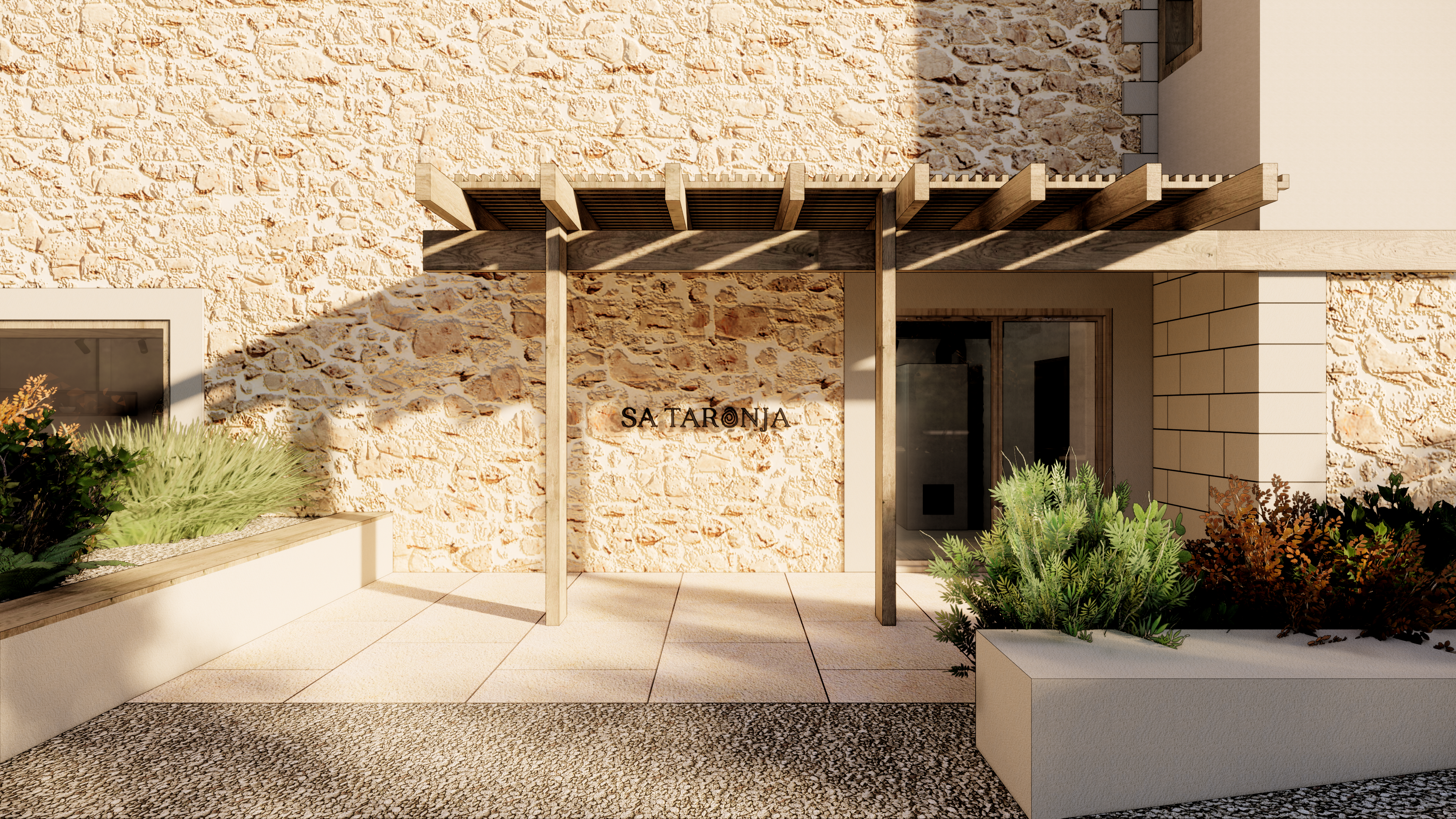
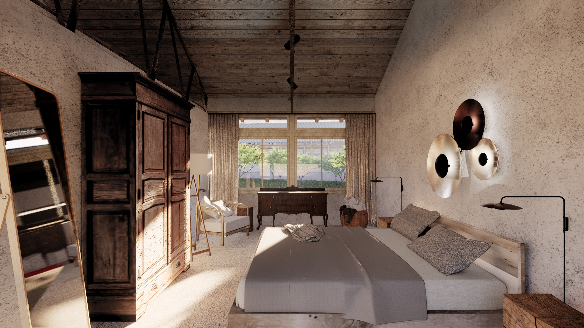
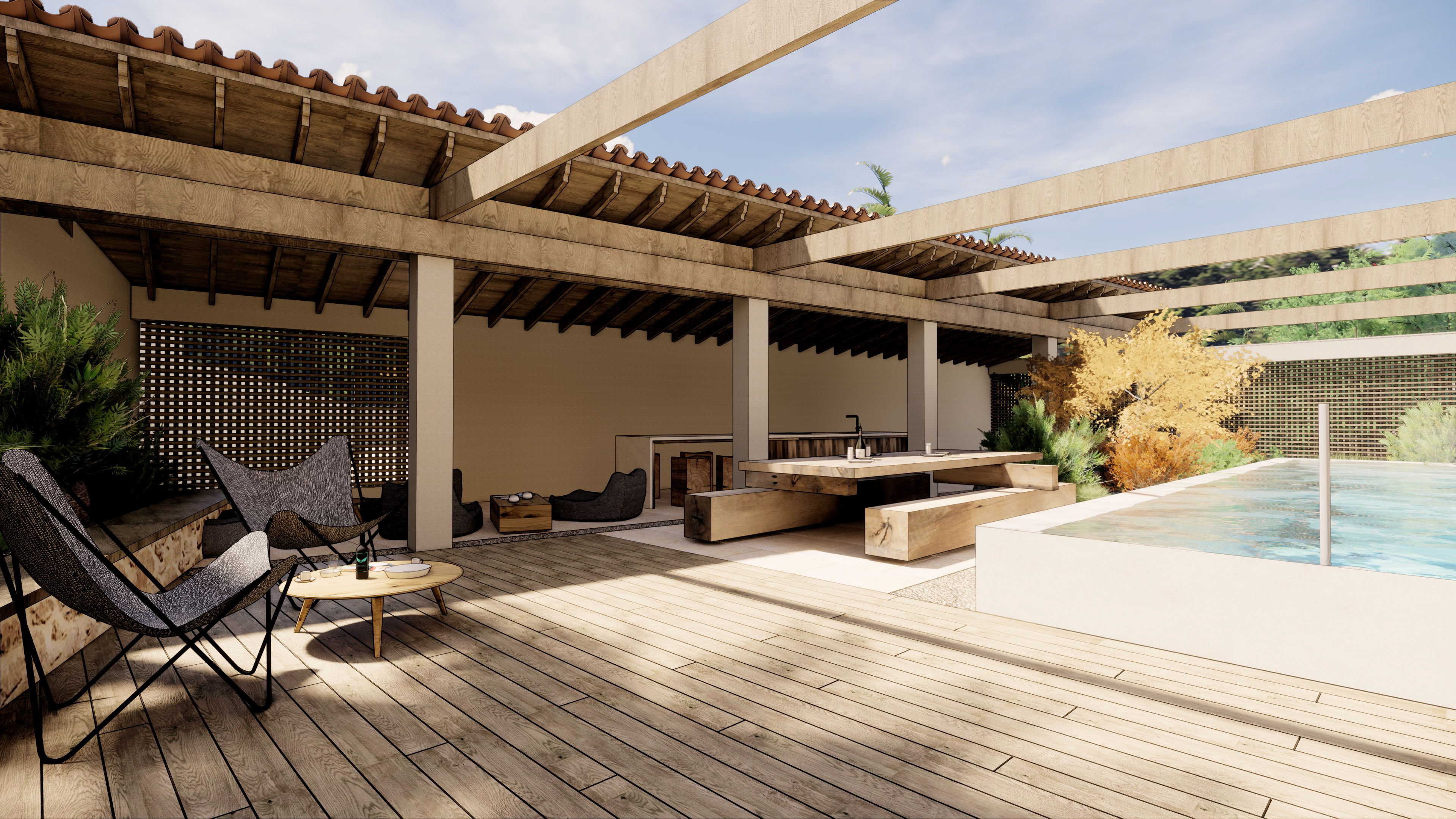
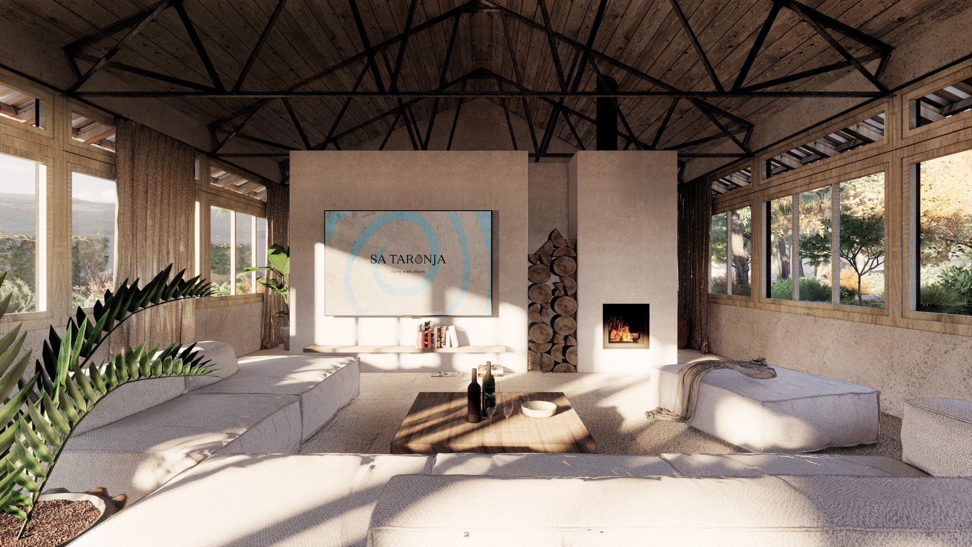
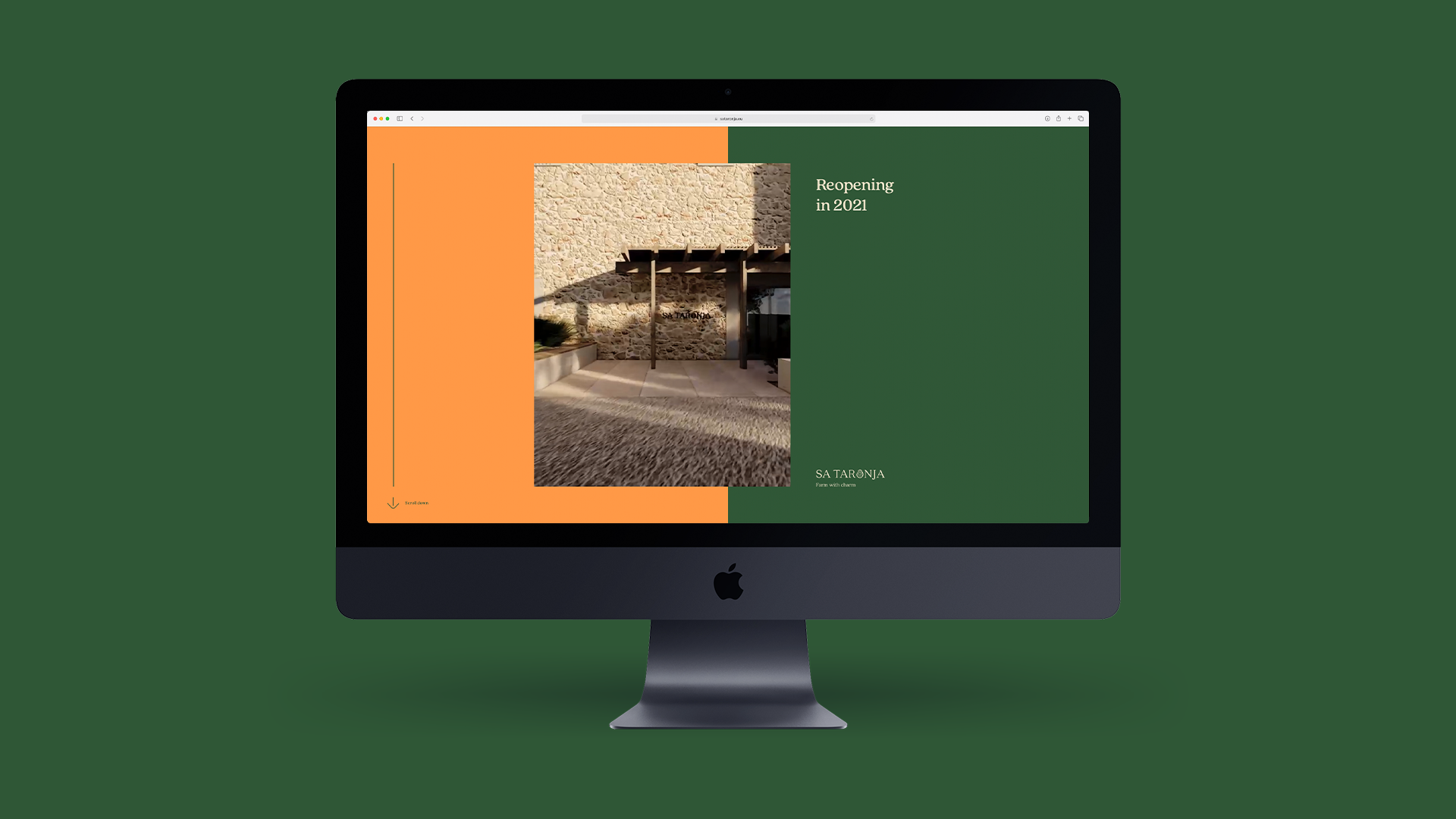
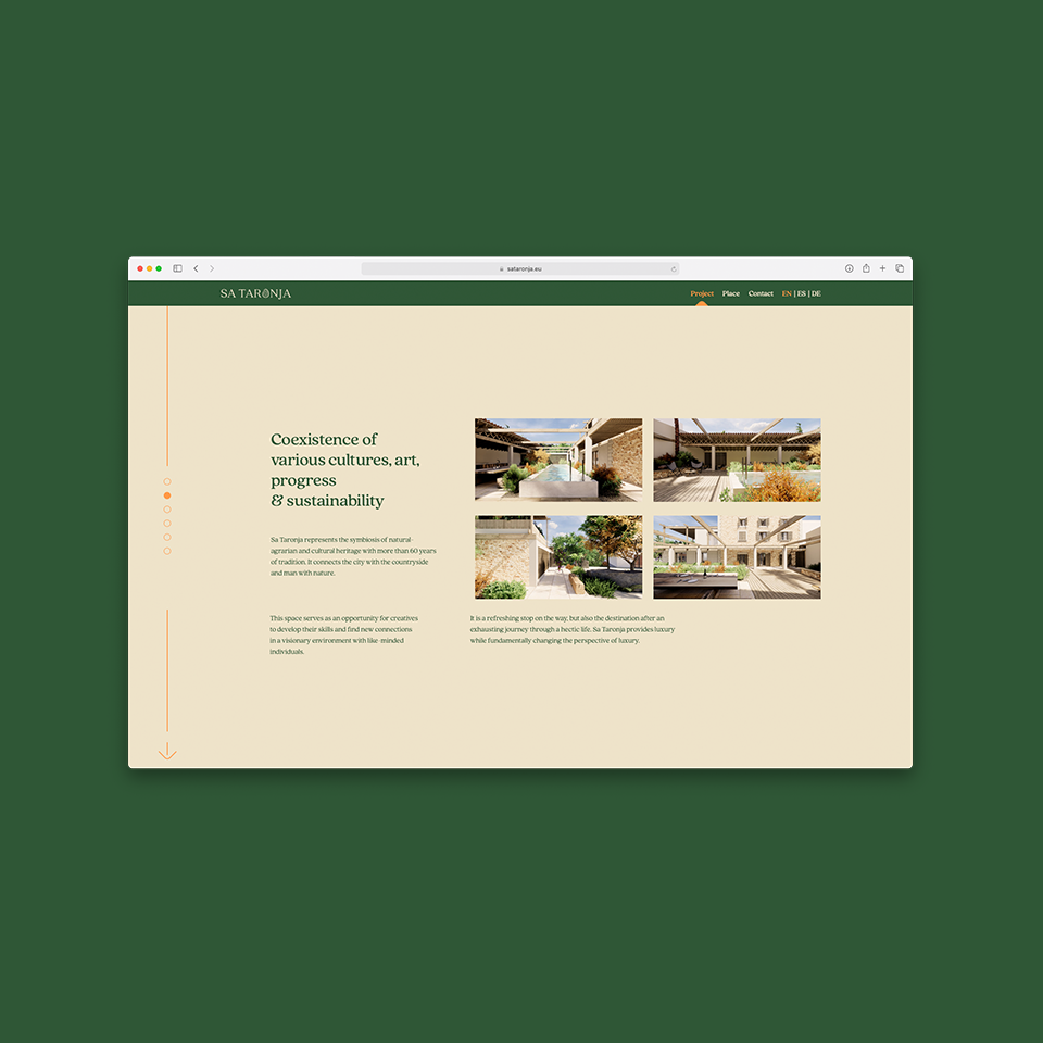
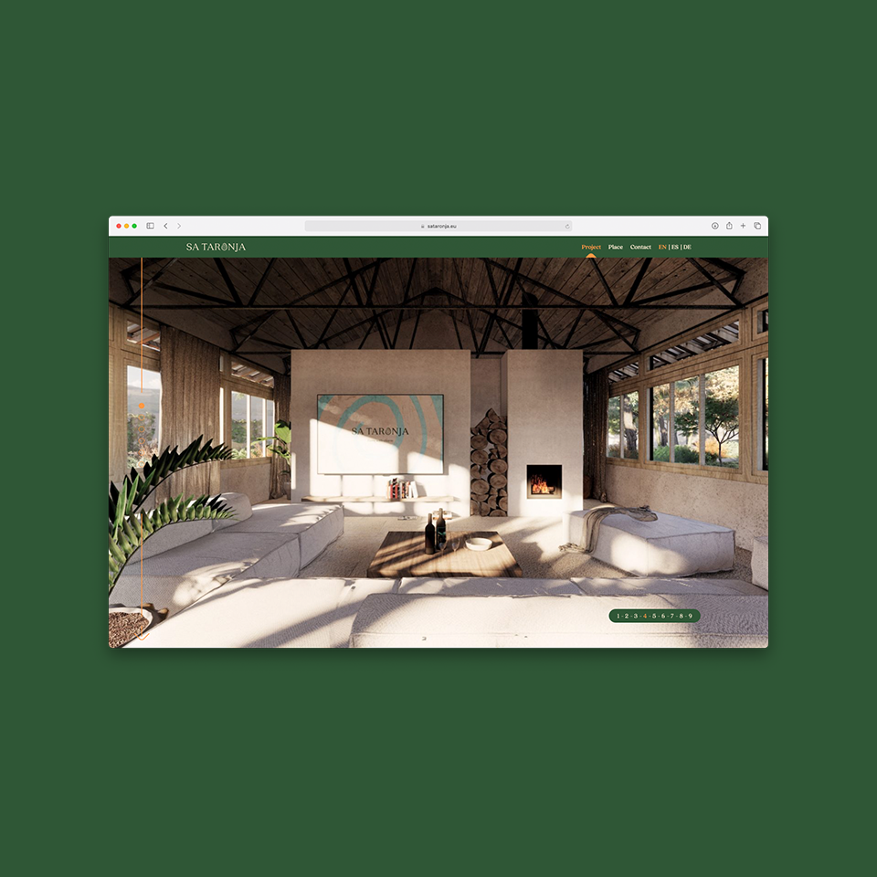
Sa Taronja is a unique place with a beautiful history. It was one of the first chicken farms in Europe, later bought by a German painter, who decided to establish a Cultural Centre in the beautiful surroundings of Andratx, Mallorca. Nowadays, Sa Taronja is under construction and will serve as the unique combination of Co-working space with ateliers for rent and a Bio Farm.
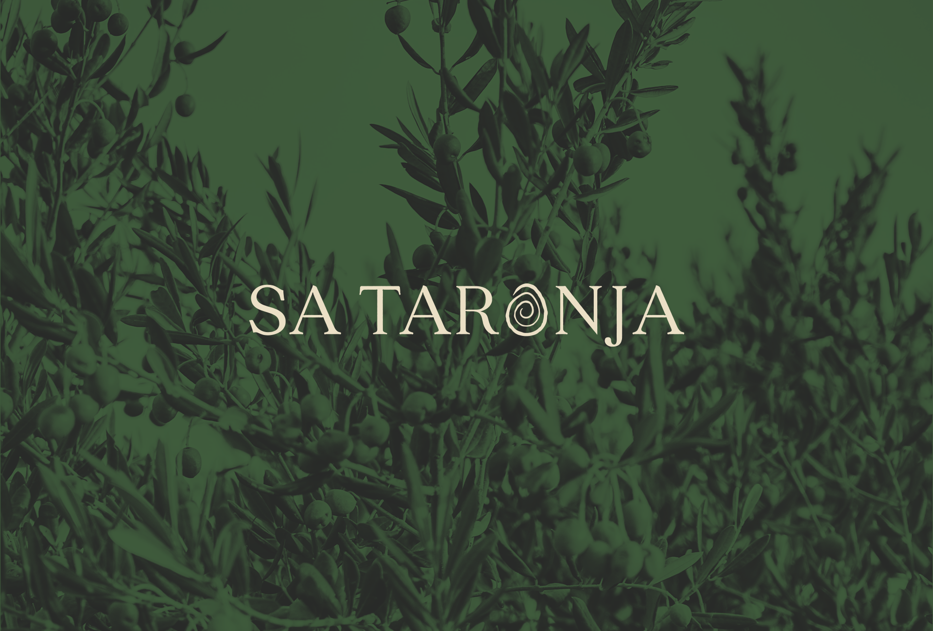
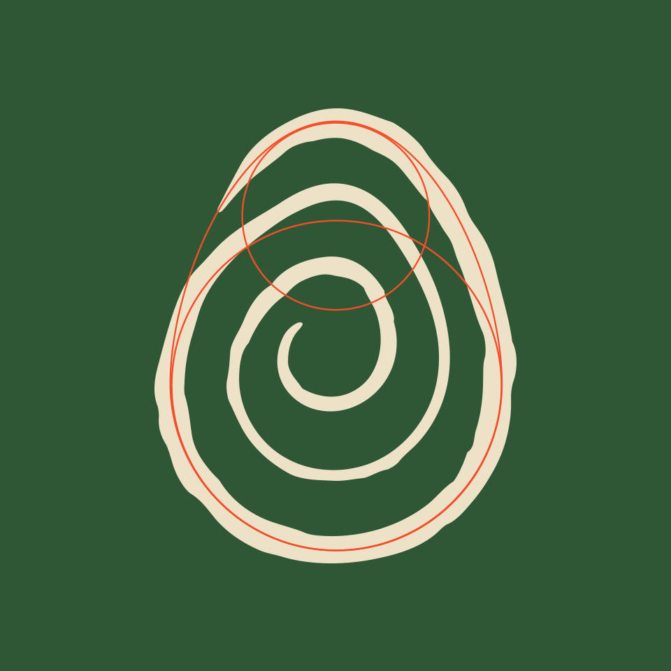
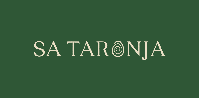
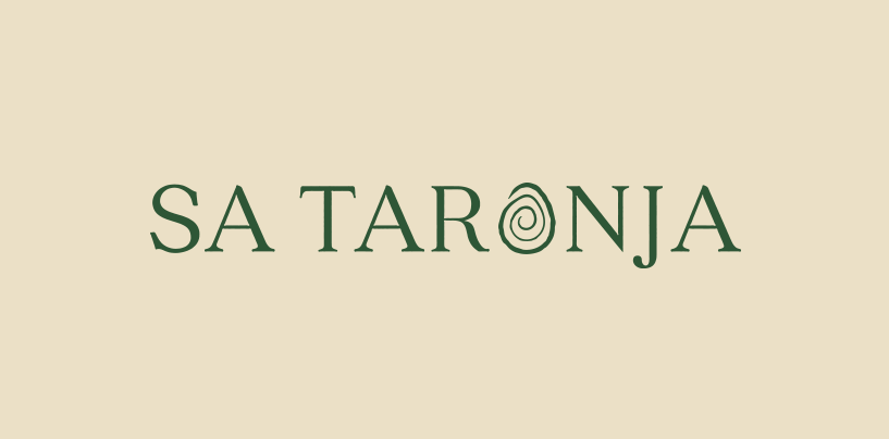
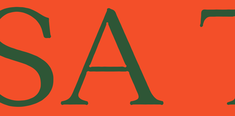
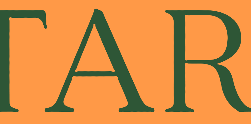
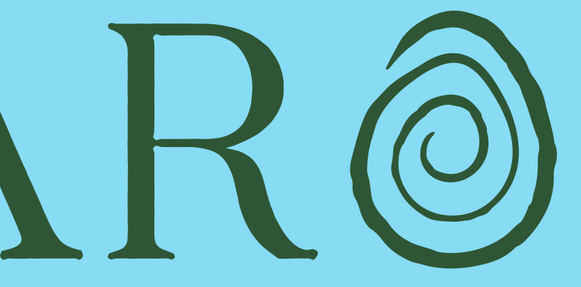
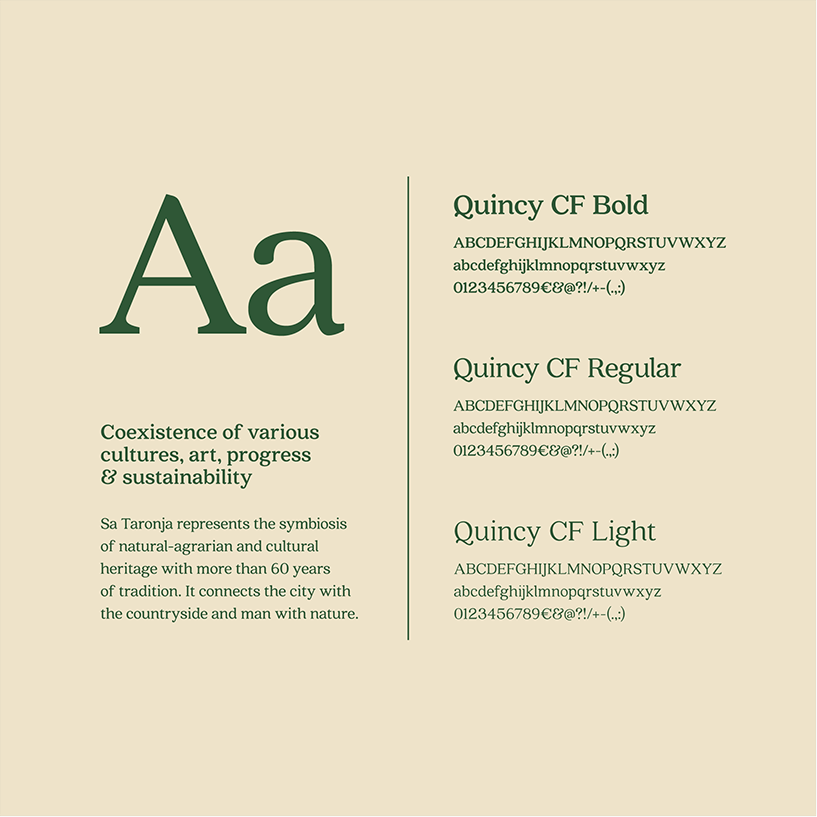
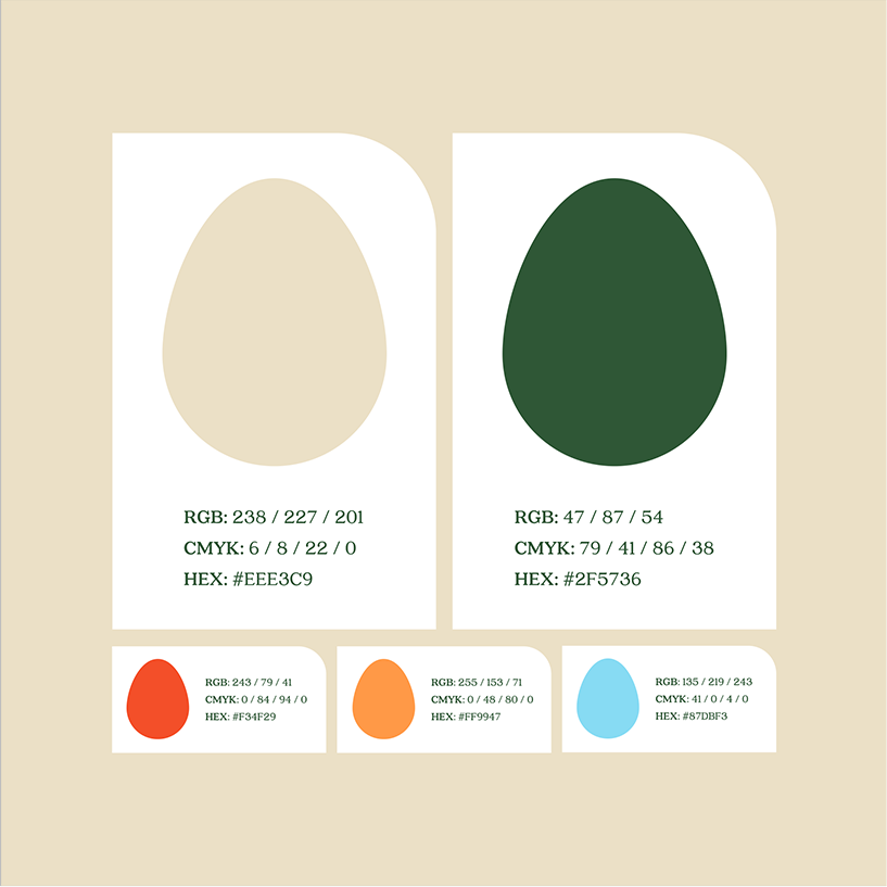
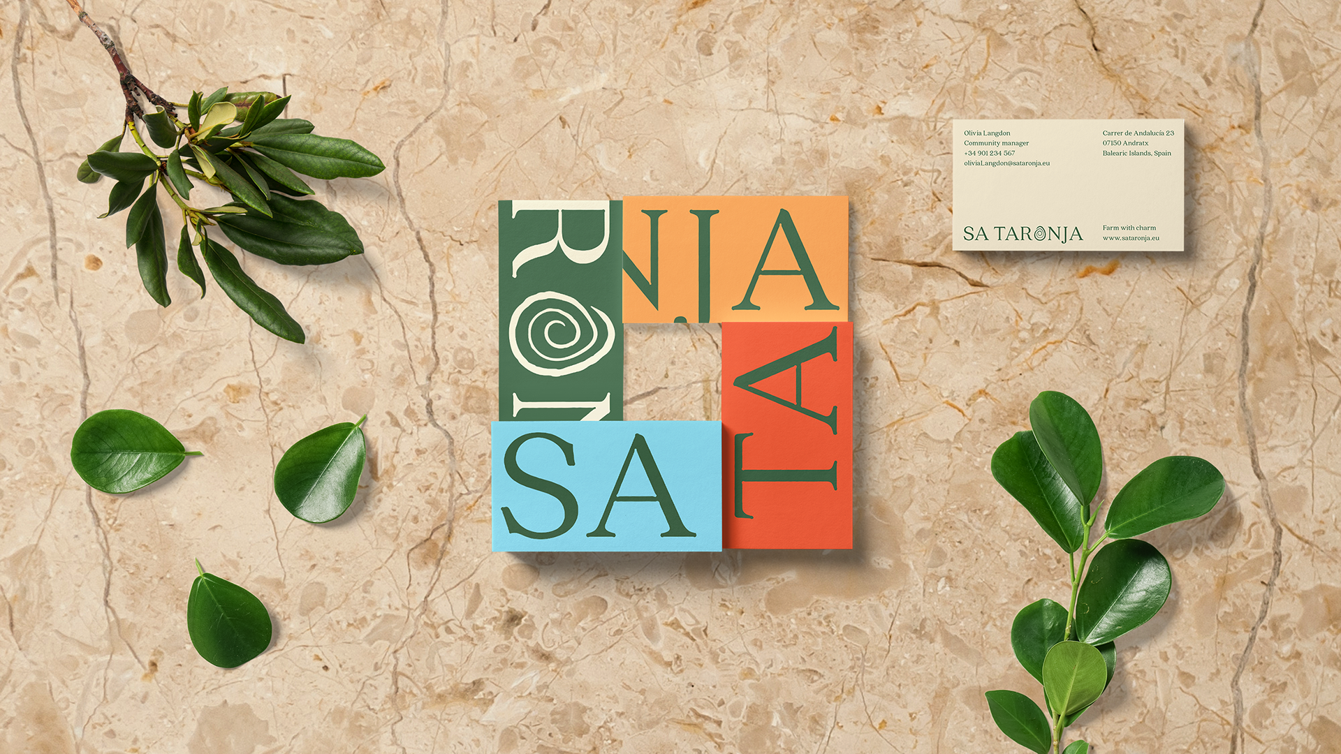
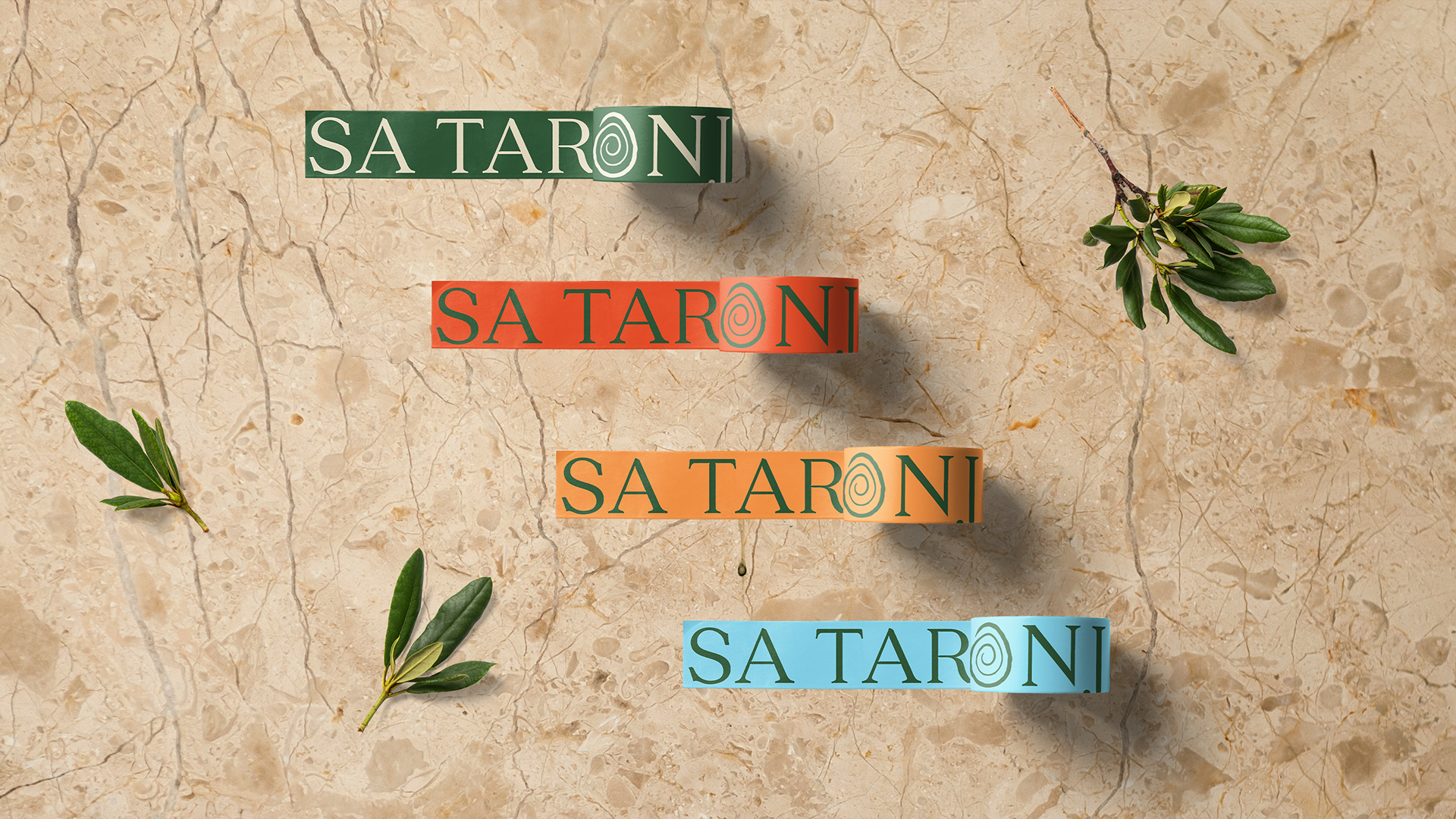
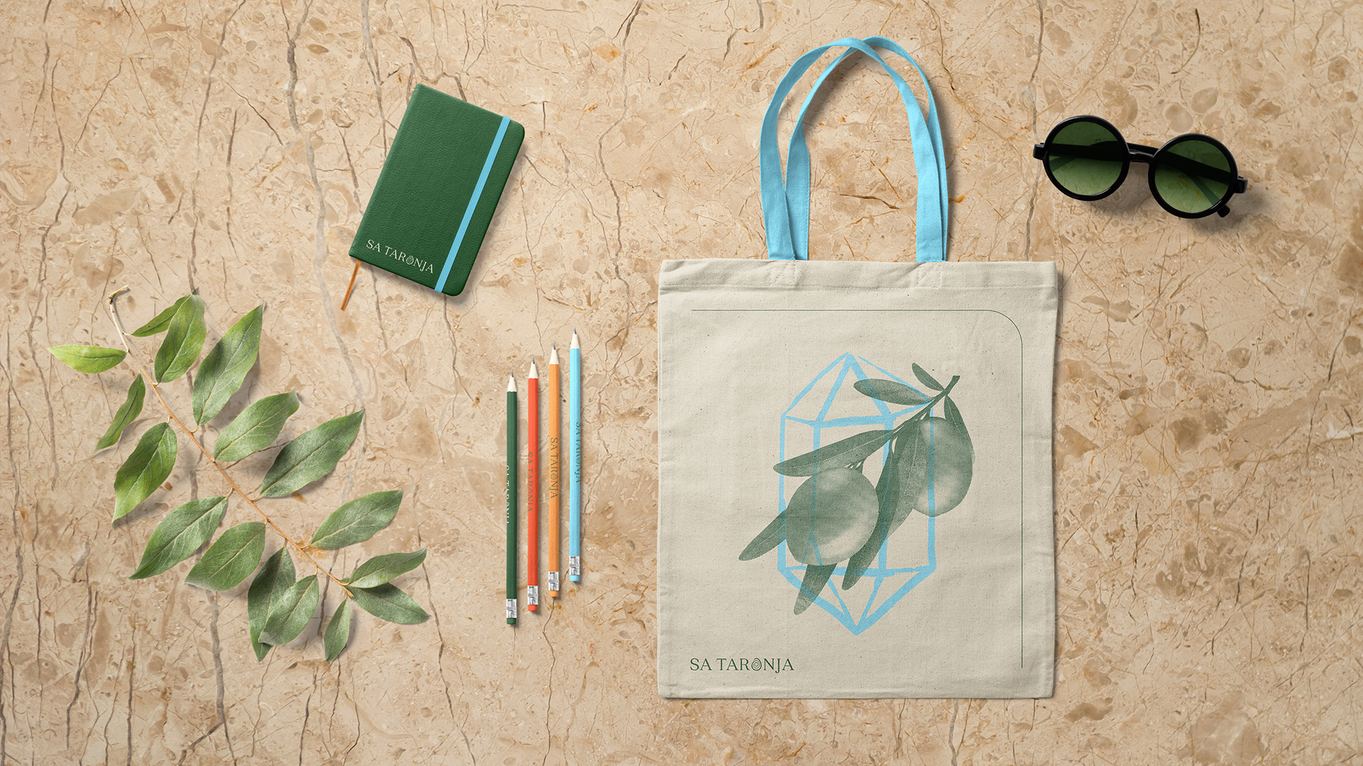
Our task was to create a Visual Identity and presentational Web site. The main element of the identity is the logotype, with the letter O replaced with a hand-drawn spiral in the shape of an egg. The spiral as the symbol of creation speaks directly to the creative-minded people and the shape refers to the history of this unique place.


Accounting: Tomáš Paluš
Strategy Direction: Matúš Granec
Art Direction & Graphic Design: Tomáš Kostrzeva
Programming: Bohuš Potočňák